Status: Incarico in corso
Superficie: 300 mq
Sito: San Pantaleo, Sardegna
Progetto: domECO
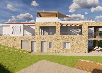
The project involves a massive renovation of a villa in San Pantaleo (Olbia), built during the 70’s. the building has already been enlarged and modified along the years and actually presents an uneven façade and internal distribution.
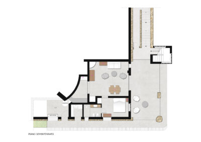
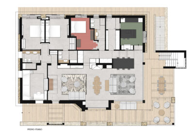
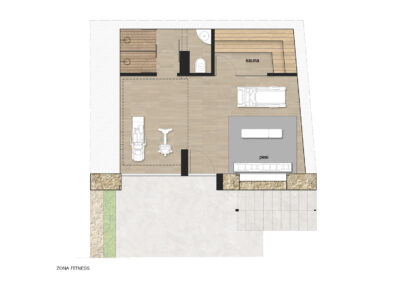
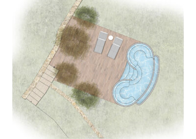
The projects aims to create a more coherent aesthetic appearance and more functional internal distribution, creating two apartments instead of small three ones, and a small spa dependence in anunderground room close to the pool.
Access and external paths and spaces are improved too, as much as the windows pattern that, at the present, is quite small and does not face the beautiful valley leading to sea, the garden nor the pool.
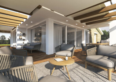
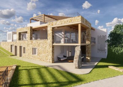
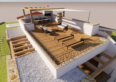
Along the south west façade a continuous terrace will be built. On this side of the house an external double staircase leading to the solarium, and hidden with bricks brise soleil.
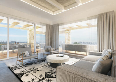
The terrace will amplify the perception of a wider internal space in both apartments, creating continuous dialogue between indoor and outdoor environments. It will also guarantee a much bettercontrol of sunrays on the most exposed area of the house.
All the information are meant to respond to an even and coherent language, with the final target to create a building marked out by an uniform architectural language, such as the traditional constructions the original project was inspired by. The stone coverings on the walls are chosen to remind traditional Sardinian ‘Stazzi’.
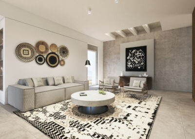
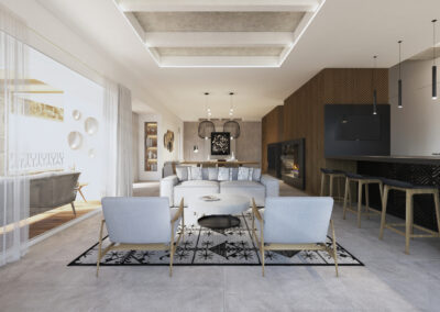
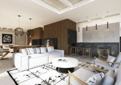
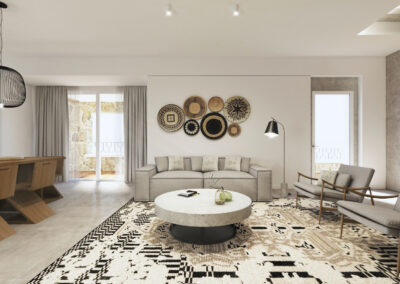
The interior design tries to apply the same logic, creating an uniform language that allows a pleasant dialogue between vintage furniture, traditional elements and the new intervention.
It was chosen to mix matter feeling materials, natural materials and geometric patterns for décor both traditional and contemporary.
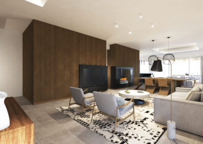
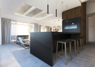
The two big wooden volumes in the living room, born to integrate new functions (tv and mantelpiece) with the existing built in furniture, are the perfect example of the design choices applied.
For the floor it was chosen a delicate cement like tiles, to create a neutral background to all the furniture and languages present.
In the kitchen and living room, the original Cerasarda tiles from the 70’s are meant to be kept and preserved.
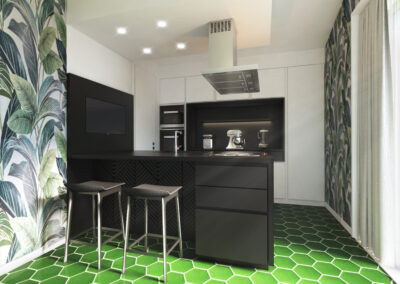
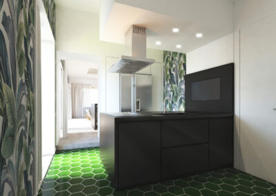
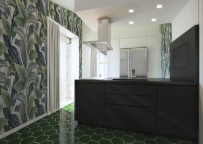
In the kitchen, it was chosen to match the bold green hexagonal tiles, with a bold jungle décor on thewalls, while the kitchen only bores neutral colours such as white and black.

