Anno: 2013
Status: Concluso
Superficie: 265 mq
Sito: Sassari, Sardegna
Progetto: domECO
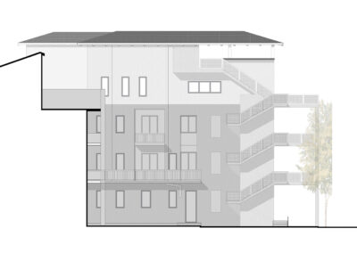
The house is obtained from a two story elevation of a building in the center of Sassari.
The existing building and the new intervention maintain a formal dialogue with each other, respecting the first while ensuring maximum contemporary archtectural expressiveness to the second.
The use of new technologies and materials, not yet available at the time of construction of the building, were essential choices for the energy performance of the building, but they belong to a modern aesthetic language difficult to apply in a historical context.
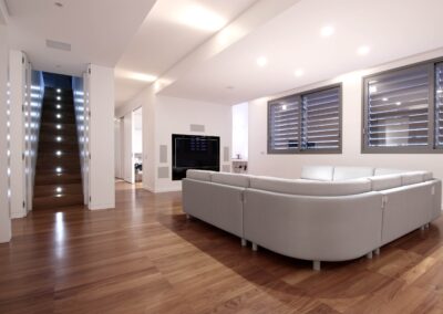
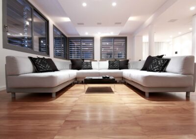
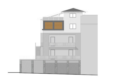
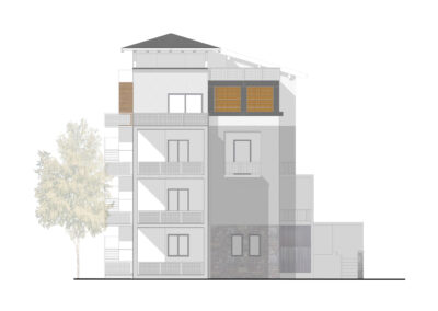
For the façades, free of defined constraints, the design choice was to create a new language, introducing large windows equipped with wooden sun louvres.
These openings are located towards the west, in a portion of the ventilated façade covered in anthracite gray metal sheet, a strong choice made to signal the innovative character of the project.
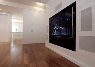
The aesthetic choices are interconnected with the plant choices and energy performance of the building, designed and built to minimize energy use and optimize indoor well-being, also thanks to the home automation system that harmonises the work of all the elements involved.
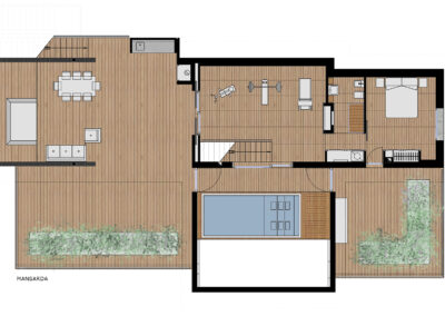
For example, while the openings with brise soleil on the west side ensure effective control of incoming solar radiation, the velux, placed above the pool in the attic, allow good winter irradiation and good summer ventilation, effectively exploiting the double height and at the same time heating the pool in winter.
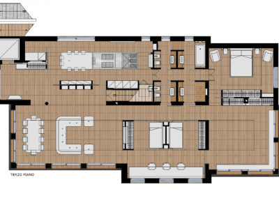
The energy aspect, albeit studied, takes a back seat to the peculiarity of the architectural choices: one of the most interesting features of the project is how the rectangular plan is organized according to atypical flows for a domestic environment, much more similar to those of the nautical world.
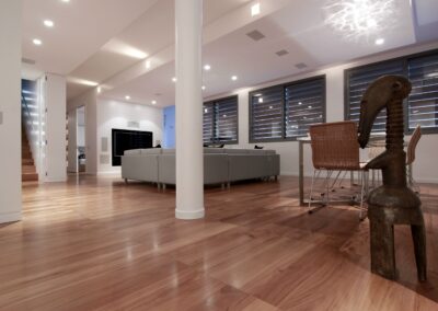
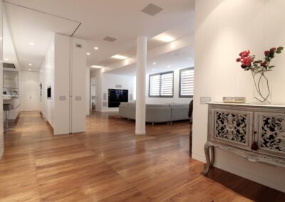
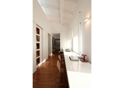
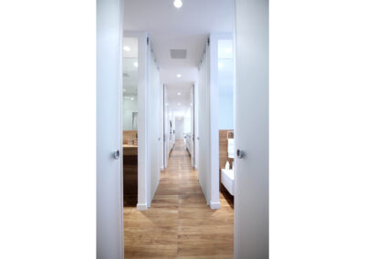
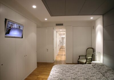
In fact, the long corridors give a rhythm to the articulation of the house, conceived as a large open space, where sliding doors and panels create an infinite series of spatial potential.
The corridors are located on the longitudinal axis of the house, on both floors, intersecting with the side rooms, thanks to the sliding panels that define the rooms.
The idea behind the internal distribution is to give greater weight to the living area, reducing the space dedicated to the bedrooms, which are reduced to a minimum, designed as a place meant only for sleep, while the rest of domestic life takes place in the living room and kitchen.
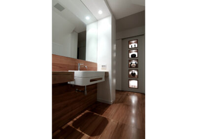
Finally, obsessive attention was paid to the finishes and the internal color palette.
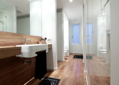
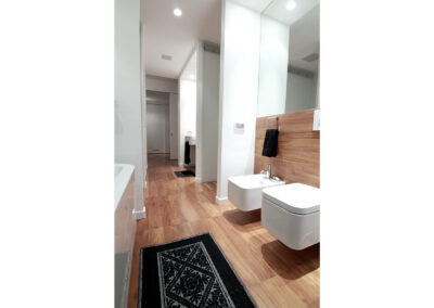
The teak floor was designed so that the joints are aligned to the center of the main corridors. The carpentry furniture, the sofa and the double bed are custom designed, using the minimal palette of white, gray and teak.
The kitchen island is a single 6 m long Corian plate.

